Buildings
Introduction
The first thing that came to my mind when thinking about 'Past, Present and Future' were buildings. However it was the word 'past' which took me down this area of study so therefore I will be drawing my attention to the the 'past' section of this topic area .I will be exploring different types of buildings and how I can use other photographers as inspiration. I will annotate my work and the photographers work creating a comparison almost illustrating how I have used my photographer research and how looking at their photographs have benefited me and my work. I haven't totally disregarded the 'present' and 'future' as I have touched upon the these two areas of study just not in much detail as I feel there is a lot less to explore when it comes to this project in terms of buildings.
However, when exploring the 'future' an idea came to me which I did follow up, meaning now I have focused a lot on the 'past' and 'future' as I realised that I could explore the future into a lot more depth than I initially thought.I thought of doing more of an abstract style of photography which was to take only a certain section of the building and photograph it so the picture looks abstract and not just like a building. The reason I chose to do abstract was because I though it represented the 'future' really well as I think people have become a lot more open to the many styles of art. Also to me, the definition of the 'future' is to move forwards and abstract to me is the movement in art. Taking the next step of this is to use Photoshop and alter the colours so the image looks different like metallic or overly bright to give it that futuristic vibe, so you could even say the image doesn't even look like a building after the Photoshop manipulation.
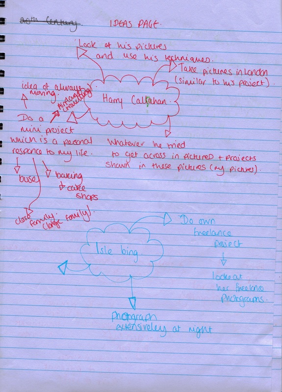
The reason I chose to look into buildings of the 'past' is because I loved the way old photographs of historical looking buildings have that brown/yellow tint over the image creating an old vintage look. This is what sprung to mind while carrying out this study as when I thought of the past I thought of old buildings with that vintage look which was created by the colour tint on the pictures. I have carried out a 'Mini Experimentation' demonstrating how I aim to achieve this 'vintage' look as I have explained the Photoshop techniques used and what the effect is of the used techniques. Below are a set of brainstorms I came up with which contain my idea's, which some of them I did not use as I didn't feel captured to me what meant 'past, present and future'.
Below the brainstorm gallery there are a slide show of images which I took to help me come up with ideas for the 'past' as I visited The Tower of London as part of my research. I took these images as they were real objects which were used in the past and I though this sort of historical knowledge could inspire me, which it did as the idea of creating the old 'vintage' images came from visiting The Tower of London. The images are not part of my final piece and were only taken as a source of inspiration.
However, when exploring the 'future' an idea came to me which I did follow up, meaning now I have focused a lot on the 'past' and 'future' as I realised that I could explore the future into a lot more depth than I initially thought.I thought of doing more of an abstract style of photography which was to take only a certain section of the building and photograph it so the picture looks abstract and not just like a building. The reason I chose to do abstract was because I though it represented the 'future' really well as I think people have become a lot more open to the many styles of art. Also to me, the definition of the 'future' is to move forwards and abstract to me is the movement in art. Taking the next step of this is to use Photoshop and alter the colours so the image looks different like metallic or overly bright to give it that futuristic vibe, so you could even say the image doesn't even look like a building after the Photoshop manipulation.
The reason I chose to look into buildings of the 'past' is because I loved the way old photographs of historical looking buildings have that brown/yellow tint over the image creating an old vintage look. This is what sprung to mind while carrying out this study as when I thought of the past I thought of old buildings with that vintage look which was created by the colour tint on the pictures. I have carried out a 'Mini Experimentation' demonstrating how I aim to achieve this 'vintage' look as I have explained the Photoshop techniques used and what the effect is of the used techniques. Below are a set of brainstorms I came up with which contain my idea's, which some of them I did not use as I didn't feel captured to me what meant 'past, present and future'.
Below the brainstorm gallery there are a slide show of images which I took to help me come up with ideas for the 'past' as I visited The Tower of London as part of my research. I took these images as they were real objects which were used in the past and I though this sort of historical knowledge could inspire me, which it did as the idea of creating the old 'vintage' images came from visiting The Tower of London. The images are not part of my final piece and were only taken as a source of inspiration.
Idea's


Artist Research
Bisson Freres

Louis-Auguste was born in 1814 and Auguste-Rosalie was born in 1826, both well established French photographers. In the 1850's the French brothers started to focus on architectural photography and soon were known for creating large prints of historic monuments from all over Europe. They rose to fame when they created a large print of the Alps. Louis-Auguste died in 1876 and Auguste-Rosaile died in 1900. I want to take the concept of photographing famous places, in my case being The tower of London which I visited just to take these images. I want to then use Photoshop to manipulate the images to create an old looking photograph. By doing this I am aiming to recreate and photographically capture moments from the past in he present day demonstrating my photoshop skills. Personally I find architectural photography interesting and when putting this into practice I really enjoyed taking pictures in this style of photography.
Art Sinsabaugh

Art Sinsabaugh was an American photographer who was born in 1924-1983. He photographed space both rural and urban. The theme behind all of his pictures remained the same as he wanted to capture the rhythms of human life and the relationships between our companions through formal elements such as buildings, bridges, houses, sky scrapers, trees, gravestones, sky lines etc. The purpose behind his pictures and the purpose behind Fenton's and the Bisson Brother's photographs were completely different and this is why I chose to research Sinsabaugh. I find it quite interesting that his photographs in a way serves a purpose as they capture what Sinsabaugh thought through one still image. He didn't specifically focus on architectural photography however is work did contain works of this style as he would capture buildings.
Atget

I have also been looking at Ategt's work in Particular 'Notre Dame'. The reason for this was because I have previously done research on him but it was this image and knew that he was of relevance to my work. It was the image on the left which came to mind when photographing for the future. I find it amazing the way he has taken the image with the tree in front of the church. Whilst taking my photographs I realised the concept of both our photographs were the same his being my source of inspiration. I used this image as the bases of my mini project which I later on within the project underwent as taking pictures relevant to his work and mine were necessary. Once again he is another photographer whose style of photography is dated so therefore is again relevant to me for my project as the colour of the photographs and the actual content of the photographs are what makes him relevant to my work.
Ted Vancleave

Ted Vancleave has had a huge influence on my 'future' section as I have been looking very deeply not only into photogrsapher's of the past but also abstract photography. His work is a mixture of buildings and abstract art which is exactly how I intend to combine my work and by doing this I hope to achieve my own sense of style in this field of photography. I have been looking at his work but in particular his 'The Los Angeles' series which is part of his portfolio which includes other pieces of work such as 'The NYC Series' and 'Epic Sunsets'. 'The Los Angeles' collection really attracted me to his work because like me it is a series of photographs which he took of buildings in such a creative way by playing with the composition, lighting and colours. I can tell he has used Photoshop as part of the process to achieve the quality of the pictures he has which tells me I will be needing to the same. His images are so bright and over the top in colour which is exactly what I love about this collection. Unlike his 'The NYC Series' which lacks the same enthusiasm in colour 'The Los Angeles Series' is exactly the field of photography I want to do for the 'future'.
Prep Work

Not only I have I researched and looked at other photographers that have done architectural photography I have also tried to capture my own take on this style. However I don't think my pictures were anywhere near as good as Atget, Fenton or the Bisson Freres but I did realise my strengths and weaknesses. As I have never really taken pictures in this style. I took hundreds of pictures of buildings but the majority of the pictures weren't any good because I only tried to capture the building as it was and placed it in the centre of most photographs. When I think of the future I think abstract and unusual which is nothing like the past as a picture of a building would be obvious. I also took pictures of buildings that look like either the past, present and future however focusing more on the past and the future. In comparison to my previous work and the styles I am familiar with such as portrait photography I feel that these images weren't as strong but were still successful. However I feel that the 'present' section of this area of study did let me down as it lacked style and originality unlike 'past' and 'future'. I thought the Photoshop techniques used in my Mini Experimentation such as the adding the warm overlay tint on the image strengthened my photographs as that is what gave it that certain feel of being old images and buildings just like the Bisson Freres and Atget.
Mini Experimentation
The Image on the left is the original image to the right. What I have done with the image on the right is increased the brightness of picture and then increased the top left hand corner more. I then increased the shadow amount by 50% which makes the object of the photograph, the light look less harsh and sharp by adding shadows on the black lines. Afterwards I added a warm (85) photo filter and increased the density by 25% to create the sepia effect to make the photograph look old and vintage looking like the Bisson Freres. I will be using this technique when editing pictures of older looking buildings to make the photograph itself look like it's from the past. I will be using this technique alongside others when editing my 'past' photographs to make them look like they are actually from the past.
Before

After


Mini Atget Experimentation
This Atget experimentation was done to allow me explore the ways in which I could make part of my piece of work abstract. This was done to help me with the 'future' area of study in this topic. When taking pictures I realised that I didn't just want to take it of building so I decided to take extreme close-up images of the buildings using the larger lens on my d-slr camera. However whilst taking pictures I though I would add layers to the image by place an object in front of the building without completely covering the building. This technique is called depth of field and it one of the 6 rules Atget followed and created and it is something I have tried to experiment with in this project. I have put a slide show of images below to show the types of photographs I produced when working in Atget's style. I have also analysed my own work talking about what i like and dislike and the effect of the photograph and how this changes the photograph.

The photograph on the left is one that I took which at my best illustrates depth of field, one of the rules Atget used. If you look at the photograph I have taken, the branches on the tree are in focus looking extremely sharp and the building in the background is blurred making this attempt successful. The concept behind all of these pictures came from his 'Notre Dame' photograph, however I wanted to experiment with his idea to achieve something of my own which I have done as the blackness and the clarity of the branches contrasts with the nude and out of focused building in the background. I like the way the branches further away in the image are a lot more fainter and slightly blurred giving the affect that the image has several different layers rather than just looking one dimentional, which is the purpose of the depth of field rule.

I have selected this image because both the branches and the building are out of focus giving a blurred image. This was one of my weaker images in this project as I did not achieve a depth of field. Also the colours in the picture don't contrast as much as the image above due to the overall blurriness of the image.

I particularly like this image because of the way the camera has been positioned. The branches are extremely close to the to the camera making them appear as if they are almost about to come out of the camera. This could also be used as a rule of thirds which was also one of Atget's rules as the branch is completely positioned on the right and the building which in this photograph is the background.

The thin branches in front of the camera lens, to me appears to look like more of a shadow of the branches. The branches are extremely faint however I do not think they are blurred. I think this photograph is very different to the rest of the photographs I have taken in this Atget project as it is obvious what the focus is on in the image. Even though the branches are a lot lighter in this picture somehow it still seems to distract me more than the building even though the building is in focus. I think this is because they appear to be so close to the camera almost directly in front of the camera.
Mini Project Final Photographs
The slide shows below are my final pieces of work for this area of study. As the 'past' and 'future' have been my main focuses within this area, those are the two slide shows which are presented to you first followed by the 'present' below. What I aimed to achieve with these photographs? To summarise what I have already written about in the introduction I wanted to achieve 3 different sets of photographs looking like they are from the era they represent. For the 'past' I was going for the old tainted photographs which I thought were very successful and we my strongest photographs out of the three sets. For the 'future' I was going for more of an abstract and art look as I wanted to portray that photography was a form of art that more and more people are using and in the future it will be considered as an art a lot more. Finally with the 'present' I wanted to pull of this rustic, dull look which represents how I see the present world which is very dull. All three sets of images are very different as they each represent that particular era to me. It is important to note that I studied the 'past' in particular whilst paying attention to the 'future' and the 'present', the 'future' more so as they were the two terms in this area of study which were photographically and artistically easier to express.
Past
Present
Future
Analysis: Before & After
I have analysed the photographs I have edited explaining what techniques I used in Photoshop and what I achieved using them. I have also attached a photo gallery documenting screen shots whilst I was editing to show the progression in my work for all my edited pieces of work. The slide show above are all the pictures I have taken for 'future' including the edited and non edited photographs.

Colour Exaggeration

In the 'after' picture you can clearly see I have increased the brightness by approximately 3/4 and fully increased the contrast making the image appear a lot sharper especially the dome. so the sky is a brighter blue. This was done using the colour balance tool in Photoshop as I increased the cyan so the colour. to bring out the blues in the sky. The building in the picture has also changed from a dull grey to a metallic like silver. I finally used the curves tool to exaggerate the colours I had so they looked over the top and vibrant looking futuristic. I love the way the colours in this picture just pop out. I also think the composition of the camera is in such away it looks as if the building is falling and also the fact that the image is not placed in the centre of the frame but on the side using the rule of thirds. It is very different to all my other abstract photographs making this one the strongest image. Click on the screen shots below to view the techniques and tools I used in Photoshop.


Reflections

In this images I realised that in the window there was a reflection of the buildings opposite it. So whilst experimenting I noticed that the colours of the reflection would change so I wanted to play with this idea. I first did the basic and used the brightness and contrast toll and adjusted that so the building was decreased in brightness and 100% increased in contrast. I then increased the saturation which brought out all the yellows and browns in the building giving me a base to start with. To change the buildings in the reflection from looking ordinary to blocks of colour, making this photograph look abstract I I increased the exposure very slightly and largely decreased the gamma correction. I feel that the blue and yellow blocks of colours in the window is what makes this piece of work abstract because it not only draws the eye directly to the centre to then work its way out of the picture, but also because the colours are exaggerated making this window not look like an ordinary window. Click on the screen shots below to view the techniques and tools I used in Photoshop.


Basic Editing

In this image I basically increased both the brightness and contrast to create the very white colour in the image. Using the photo filter I then selected a greyish colour to create a colder feeling to the image unlink adding the warn brownish orangey tint making it feel the complete opposite, warm. Click on the screen shots below to view the techniques and tools I used in Photoshop.


Match Colour

The main tool which I used to achieve this effect was the match colour tool. I increased the luminance and colour intensity by 100% which brought out the natural colours in the image and intensified them. I then finished of by decreasing the shadow by the full amount so the blacks and shadows in the image doesn't appear so harsh which would instantly darken the image. I like the way this buildings has that golden tint to it making it look more of a painting rather than a photograph. This is why I feel this photograph looks abstract and that is how achieved this. Click on the screen shots below to view the techniques and tools I used in Photoshop.


Artistic

I edited this photograph wanting to achieve an artistic look. Once a lot of empty space remains in this image so therefore I wanted to create the illusion that the emptiness was not the sky as the building looks like it has been drawn so the white background matches with the image better. To achieve this I dramatically increased the brightness and contrast which created the white background.I then adjusted the exposure so the detailing on the building was intensified as it went darker and the colour of the building became lighter like white. Click on the screen shots below to view the techniques and tools I used in Photoshop.


Filling The Frame

I used the technique filling the frame in this picture because I tried to capture two sides of the building so my picture would have some sort of perspective. The only editing I did for this photographs was adjusting the exposure. Click on the screen shots below to view the techniques and tools I used in Photoshop.

