My second project was called streephabet. I had to take a photograph for each letter of the alphabet using only natural objects such as buildings, walls, floors, chair legs etc. I wasn't allowed to manipulate the object in anyway. I have written an analysis for each letter explaining what I liked about the letter, what could be improved and what was good about the picture. I also had to do some artist research and prep work to help me with the final piece. I had to look at how artists used letters in their work and how the letters influenced them and what effect the letters had on their work.

The letter 'A' which I decided to use was the legs of a road sign. I found this by the Embankment underground station in London. I really like this picture because it looks exactly like an upper case letter 'A' and is looks more mordern in comparrison to the letter 'j' and 'w' which look more caliigraphic..

I think this letter would look a lot better if the design of the letter 'b' was simple rather than having the leaves which is quite distracting. I also think it would look better with out the black bar going through the center of the 'b'.

The letter 'C' was part of a gate design. I found this picture locally while I was walking home. I like this picture because it looks like an obvious 'C'. It also reminds me of calligraphy writing, which I did research for this project. I think that the curled in ends of this letter adds to the calligraphy effect and makes the letter look alot more attractive.

I think this is one of the weakest letters I have used in this project because it's boring as its a thin crack on the floor which isn't creative.

This picture of the lower case letter 'e' was taken from a chair leg which was in London, I particularly like this letter because the metalic silver adds to the character of the letter. However I think this picture could of been better if it was taken in more focus.

These pipes were running alongside a house. I think overall this picture is good in terms of the pipes representing the letter 'f' but it is a little bit out of focus which is the one thing that could be improved. Also there isn't anything distracting in this picture which focuses your eye on the 'f' alot quicker than some of the other pictures such as 'b'.

This picture of the letter 'G' was taken in school. I think this photograph is different to most of the photographs I have taken because this is one photo which was taken using a personal interpritation of what letter this stone piece looked like. For example i see this as the letter 'G' but someone else may see this as an 'L'. This photograph could of been improved if the window wasn't behind the letter so the reflection of the flash from my camera would not be showing in the phot.
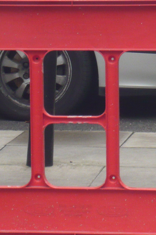
I also took this photo in London. The object I used for the letter 'H' was behind a gate so I couldn't take the picture without zooming in so the quality isn't as good as it could be because I was quite far from the object as the gates were restricting me from getting any closer. I think if the car was not in the picture the photograph would look a lot better because I think the tire of the car is quite distracting due to the big gaps in the letter. However I also think that the object used for the letter 'H' looks good as it looks quite formal rather than fancy like the other letters such as 'c' or 'e'.

I found this letter 'I' on my roof. I think that if I had taken this picture a little bit earlier during the day the quality of the picture would look better because there would be more natural lighting which would brighten up the picture. However I think that considering I had taken this picture from a far distance and had to zoom in on my camera the quality of the letter "I' is not blury it's just the lighting which could be improved.

This letter reminds me of calligraphy and an older style of writing. This letter looks more ancient than modern because of all the cracks around the 'j' and the end which curls in adding to the age of the letter and calligraphic style.

I found the letter 'k' while i was walking through the school alley. I like that the two lines coming of at opposite angles are brown and have a rusty look to them and the straight vertical line is grey. I think this makes the 'k' look more obvious to notice where as if it was the same colour it would be harder to notice as the dull grey colour would not stand out as much as the brown rusty colour.

The letter 'L' was taken of a speed camera hanging from a pole. I like this picture because there is a good amount of natural lighting and considering this was taken from a far distance the quality of this picture is reasonably good.

I think this is one of the strongest pictures in this project because it is very different to the other pictures. I particularly like this picture because I think this photograph has a lot more character which is due to the spikes coming of from the top of the curves of the street light and the bulb between the the two curves. I think the lighting and quality of this picture is just right which makes this picture stronger.

This 'n' was part of a piece of art work on a wall in London. I think there is the right amount of lighting in this picture as it is not to dark but not extremely bright either. I also like that the picture looks more 3D than 2D. This is what makes this picture different top the other pictures.

The letter 'o' was photographed in an abandoned pub. It was a window which had been bordered up. I like the idea of the bricks making the shape of the letter, which is different to the previous letter 'o' I had photographed and was going to use. I decided not to use the previous photograph because it was a boring photo with no character and was very uninteresting to look at.

There is not much natural lighting in this picture, if there was this picture would look alot better because there would be more light which would make the picture look brighter and sharper. I like the way the pole and the satellite dish makes the shape of the letter 'p'.

The letter 'q' was also part of a gate design. I think the lighting on this photograph is a little bit dark even with the use of my flash. However I like the way both ends of the letter curls in because it looks like calligraphy writing. I think I have used too many gate deigns as letters so I should have looked harder so I could reduce the number of letters which have been part of gate designs.

The letter 'r' is said to be one of the hardest letters to find. I found this while I was walking home. It was engraved onto a brick which I found in a pile of broken bricks. The photo is a little out of focus but you can still see the 'r' very clearly. I think if the photo was taken in focus this picture would have been one of the strongest pictures because other than that the lighting and framing of this letter is considerably good. Even though it is a little out of focus I think it is one of the strongest pictures due to it's uniqueness from the other photographs

The letter 's' was part of a wall design which once again I found in London. I really like this letter because it makes who ever is looking at this caliigraphic looking 's' think about what letter this photo represents even though to some people it may be more obvious. I think the detail background makes it harder to identify the letter. I also think this is a strong letter because the object used represents the letter very well.

I had photographed this letter over a bridge in London. It was hanging of the bridge over looking the river t hames. At first I was going to use this as a letter 'y' but after I had uploaded the picture onto my computer I realised it looked alot better and appears to look alot more like a 'T' rather than a 'y'.

The silver metal which I found stuck into the ground outlines the letter 'u'. The lighting in this picture has worked out really well due to the direct sunlight which has been reflected on to the metal. The only thing which I can say about this picture which could of been better is the leaves and its bright colours in the centre of the 'u' which are distracting which means it takes longer to notice the 'u'.

This too was part of a gate design. This is very simular to the letter 'c' which is why I think this picture is also one of the weakest letters because I have used the concept of a gate design more than once which isn't very creative or unique. Also this photograph is taken out of focus. If it had been taken in focus it would of increased the quality of the picture.

I found this letter engraved on the bottom of a street lamp in London. This is one of my favourite letters because the letter is represented so well and the lighting and focus in this picture is perfect. I like the little cracks around the 'w' because I think it makes the letter look like an older style of writing rather than modern such as the letter 'a' which in comparrison looks alot more modern.

The 'x' I found were legs for a table. I think the letter 'x' was the plainest letter to photograph because anything which outlined an 'x' was either railings, bars or table/chair legs. Before I decided to use this picture as my final photograph I had taken other pictures of this letter. I chose this letter because this had colour to the picture and the other pictures didn't have much colour as the letter itself was either white or grey which I found looked to boring.

The rose in this photo oulines a slightly slanted 'y'. This to is part of a gate design but is different to the previous gate designs I have used as firstly this one is in colour and secondly this is an image of a flower whereas the others were more curls and squiqles. This picture would have looked even better if the car wasn't in the background.

This too like the letter 'z' makes who ever is looking at the photo think about what letter the gate highlights. This picture would look alot better if the vertical planks of wood were behind the 'z' rather than in front so then the 'z' would be more noticable. I think this picture holds just the right amount of lighting.
