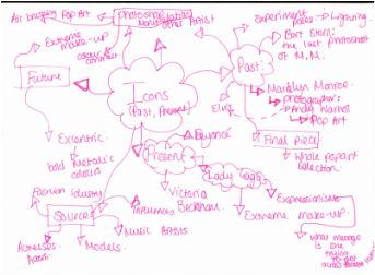
Icons
Introduction
This is a band new topic area of study which I will be focusing on. In this topic I will be looking at particular icons who was very influential at their time. Unlike the last topic, which I focused on the 'past' and the 'future', I will now be paying attention to the 'past' and the 'present', the 'past' in particular.
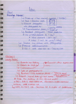
The images below are of my ideas which was the starting point for me for this topic. The reason I will be focusing on the 'past' is because the present is hugely influenced by the 'past'. I did a lot of research on one of the largest icons in history, Marilyn Monroe. She was a huge fashion icon and an even bigger sex symbol. I chose to research her because she had a huge impact on the women in today's world as she invented the idea that 'curvy is sexy' as she herself was voluptuous.
I think for this topic there is a lot of ground that be covered for the 'past' and a fair bit for the 'present' however for me personally there is not much involved for the 'future' as time is always changing and for the critical studies I wanted to explore the information I already have as something such as fashion and icons is hard to predict and document for the future. If you have noticed I haven't covered all three sections for each area of study as for each area of study certain periods of time will be more important than the others, in this case being the 'past'. To help me achieve my end result I have done prep work such as lighting experimentation's and photoshop experimentations to help me investigate this area of study.
Icons have always been a huge part of life and this is why I wanted to explore and investigate a topic such as this. At the end of this investigation I hope to have achieved to produce work like Andy Warhol. This is another reason to why I wanted to explore Marilyn Monroe because he was a famous pop artist who had produced some of his best work which involved her. I didn't come up with the idea of doing pop art straight away as it never occurred to me at first but after taking pictures of my model I realised I could drastically change them if I turned them into pieces of poop art. In this project I have chosen to work in a different style to my other investigations as I wanted to cover different types of photography and art and pop art for this project seemed ideal.
At first I wanted to do more of a fashion photo shoot but wanted to actually produce a different style of work and I know if I had done fashion photography it would of lacked a certain quality as fashion photography is a very difficult to achieve a high quality photograph. Looking at the photographs I had taken I realised that the hair and make-up did not show in the photos to well and looked very flat lit and kind of boring in a way. Photoshop was a huge part of this project as this was the software I used to create my final pieces of pop art. I have analysed my work illustrating what worked well and didn't work well in this project and how I changed that to get what I wanted.
Idea's
Icon Of The Past
Marilyn Monroe

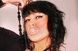
Marilyn Monroe who was actually born Norma Jeane Mortenson was one of the biggest style icons in the 20th century. Her career as a model started when she was caught photographing for the 'Yank Magazine' by a photographer called David Conover. She signed a her first contract with Twentieth Century Fox and began to earn $125 a week. She was known for her sexy and voluptuous curves which at the same time she portrayed a sense of innocence. She was a global name and and icon. When I was looking at the images of Monroe I realised that she had a natural look to her and in almost all pictures her lips are the focus of the picture whether that be in black and white or colour. This is how the sexy look was created. Compared to my present day celebrity that I researched her make-up is very simple and natural and her hair is very similar to the other pictures.
Research: Bert Stern
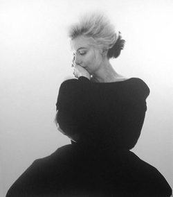
I have chosen to research Bert Stern because he has a whole photo shoot dedicated to Marilyn Monroe called 'The Last Sitting'. I thought that it would be extremely useful and relevant to research him as my work relates to his. I love his photographs of Monroe because they are very natural and beautiful and they have all been shot against a plain background and some of the pictures are head shots which make the hair and make up important in the photographs. I had my model use the some of the same props Monroe did and imitate some of her poses. I found it very interesting looking at his photography as everything about the pictures were natural. Now realising this I feel that I should of kept the eye make-up a little bit more subtle. I felt that my model carried out her poses very well and this is what I feel, strengthened my photographs. Before taking final photographs I took prep pictures to experiment with the lighting poses and even props such as a necklace. I have chosen 5 final images from my final pictures from a set of pictures I took. I will explain why I have chosen and compare them to Bert Stern's work. I have learned a lot look at his work as the composition of the camera as the lighting in these set of photographs remain the same throughout and is more easier to achieve than I thought it would be. I feel that each picture of Monroe tells a story and I have annotated the pictures to show my interpretation of the pictures and what I think of the images and how they have inspired me for my photo shoot.
Andy Warhol

Andy Warhol has inspired me to adapt on my Marilyn Monroe project. He was hugely influential on the American Pop Art Movement. Looking at his art work and his Marilyn Monroe paintings I decided to take the concept of pop art and incorporate it into my work. I like the idea of taking an ordinary image and making that one image look extremely different through the use of colours and chosen. I selected one image from my final selection of images and used Photoshop to create the pop art effect. He was hugely influential when coming up with this idea as looking at his work I took into account how the use of colour was very important. I like the way the colours are exaggerated and seem to be extremely bright and even though the use of colour is over the top that makes the images stand out and that is why he did amazing pop art. I started off by using one image and transformed them and made them look totally different through the use of different colours and by doing this I created my own pop art piece of my own Marilyn Monroe inspired project. I have also taken interest in his Elvis art work and other pieces of pop art. His work has greatly inspired me as his pop art has allowed me to challenge not only my Photoshop skills but also it adds another dimension to my piece of art work as I can make an ordinary picture such as the pictures above (Marilyn Monroe 5 from 50 inspired photo shoot) look unique and extremely creative.
Hair and Make-Up Inspiration
I found these videos on youtube which will help a lot to create the Marilyn Monroe overall look. Before I take my final pictures for this section I will be experimenting with the hair and make-up and first do a trial. I will document this through pictures and show the process of my experimentation. As I already have a model for this shoot I already know what I will need to edit in Photoshop, her lips will be one of the major parts I will be editing as I will have to make them look a lot more plump and fuller as this was one of Monroe's tools to create her iconic look .
Prep Work
Lighting Experimentation
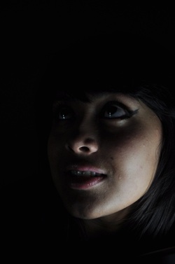
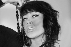
When I was researching photographs of Monroe I found two black and white photographs which actually made me consider lighting. When looking at the two images it made me want to light the model in such a way that that she was lit well but at the same time the background was black creating a shadowed effect. I really like the idea of half lighting my model because it will create such a contrast between the shadows and light. Even though lighting isn't really something I need to focus on this project, as once Photoshopped the images will be totally transformed into bright pop art pieces, I still want to experiment with lighting to see how Bert achieved his photographs. Visually I can tell lighting has played a significant part when photographing Monroe. When lighting my model I tried to keep in mind that the position of my model as I only wanted to light certain areas of her. In this experimentation I only photographed my model using extreme close-ups of the face as this is what I would be doing when taking my final photographs. I'd rather use close-ups of my model than body shots as I wanted the different lighting effects to be extremely noticeable. Below I have put up a slide show containing all my images and below that I have analysed some pictures.
Critical Analysis


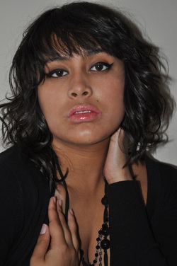
The image on the left is a lot brighter than the photograph on the right. This is because I only used one light lamp in the right image to light the models face, which was done from underneath her chin. The lighting effect in the left image was created by using two light lamps which was positioned directly in front of her face. In both shots all the main lights were off and only the lamps were on which was the only lighting used in both images. The outcome of using these different techniques was to get two different effects. Comparing the two I prefer the one which is darker lit as this creates shadows on the models face and also I like the way her face smoothly fades into the blackness of the background. The brighter lit picture is to lit too much and just looks as if it has been taken using a straight on camera flash as the models skin appears to be more pale than it actually is. The colour of the skin on the right appears to look a lot more natural and blends in a lot better with the shadows which adds depth to the picture. However if I combined the two images, if the brighter one was slightly darker and the darker one was slightly brighter with the shadows remaining I think the image would look a lot better. The image below the two images side by side is the image which combines both effects.


Ideal Lighting
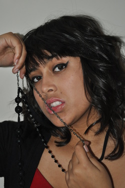
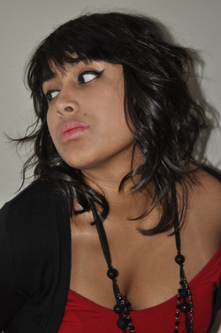
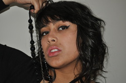
5 from 50
The images below are the final pictures I took for my Marilyn Monroe inspired photo shoot. I have a set of 50 pictures, in which there are a mixture of images such as some strong ones and some very weak ones. I have also explained and annotated various pictures to show which one was weaker and stronger and why. I found this photo shoot enjoyable because the hair was a lot more simple to do than thought. I used the two videos from youtube to help me with both the hair and make-up which I found very useful as I didn't use the exact same techniques to result in the same outcome because I thought my way was easier for me. The make-up in this case too, was easier than I thought it would be as it was quite simple as the only features on the face that needed to be emphasised which were the eyes and the mouth. I realised during the photo shoot that the hair and make-up weren't as important as I initially thought as I would later be converting the strongest images into pop art like Andy Warhol. I developed this idea even further as I thought I would do and Andy Warhol inspired final piece for this section of the style icons. By using his pop art work of Marilyn Monroe pop art paintings I am able to combine the present and past together as Andy Warhol was ahead of his time as he was a huge influence of the American Pop Art Movement.
Top 5: Critical Analysis

Why have I chosen this picture as one of my top 5 pictures? The reason I chose this picture as part of my top 5 was because I like the way the model is using her necklace. This is similar to one of the pictures of Marilyn Monroe where she is using one her necklace to make the photograph more engaging. Its the use of the props which has made me select this photograph even though the facial expression of the is slightly weak.
This is has to be my favourite picture purely because of the composition of the camera and the model. I like the fact that I have taken the picture as a close-up portrait rather than landscape like the image above. Even though the lighting is very flat and not very interesting at all I will be using this image as my final image to work on. Once I have used Photoshop manipulation on this image this will transform into a bright colour popping image which Andy Warhol has inspired me to. I will use different techniques to get the pop art effect and will explain the techniques I have used and which one I preferred and why.
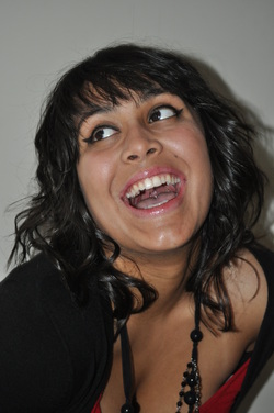
This image is the most unique image in the sense that the model has posed differently in this image. This too is similar to the pose Marilyn Monroe as she is laughing. The reason I am not using this picture as my final image is because the positioning of the camera isn't quite right. I don't like the high angle camera position as it makes the models head look slightly weired and out of proportion. There is also to much room at the top of the picture which kind of makes it look empty. Compared to many of my other pictures this is still one of the strongest pictures despite the few flaws.
This is similar to one of my other top 5 pictures and the reason I have chosen this picture is because firstly unlike the other picture it is taken as a portrait. Another reason I have chosen this picture is because it fills the frame a lot more and holds the same pose as the first picture.
I like the pose that the model is striking for this photograph. I also like the way that it nicely fills the frame however the reason I did not choose this picture is because the models top has fallen of her shoulder which makes this image look more seductive than it should do.
Photoshop Manipulation
The pictures below demonstrate how I have used Photoshop to airbrush an image. In the before picture you can tell it hasn't been edited as the skin looks patchy and doesn't appear to look smooth and all one colour. In the after picture I used the paint brush tool and selected the neck area as the colour that I wanted to air brish the model as I wanted her skin colour to look all one. I then lowered the opacity to around 9% s the colour doesn't look so solid and blends in smoother to the models face. I then used the paint brush tool again and lowered the opacity and chose a peach colour and kept the opacity low. I also used the same technique on the second set of images but just exaggerated the colours. The 'after' image looks fake and looks like it has been worked on, however this image is weaker because looks so over the top and unrealistic it defeats the purpose of air brushing.
Before

After


Mini Project Pop Art Final Pieces
Mini Project Andy Warhol Final Pieces: Technique Analysis
1)Paint Bucket Tool

There were two different techniques which I used in Photoshop to achieve a pop art effect which was inspired by Andy Warhol. I opted to use the paint bucket tool first because I thought that it would be a simple process to achieve my pop art final piece. By this I mean that it was a basic tool that I was familiar with and was able to use to my advantage. The most important concept to keep in mind when I was using this method was to use colours which were bright and would clash to make everything 'pop'. So I would select a colour from the paint bucket tool and then click the area I wanted to apply the colour to. I didn't want to think about the colours to much as the purpose of this project wasn't meant to look so thought out and neat but more crazy and artistic. For example, in the image on the left I used colours such as purple and yellow which don't necessarily compliment each other however when put against each other they clash making the image look bright, loud and colourful making all the colours pop even more so as they clash with each other. After deciding on the colours the only other additional tool I adjusted was the opacity for the paint bucket so when the opacity was toned down the colours would become a lighter shade and when tone up the colour would become darker and more visible. I changed the opacity in the picture on the left in areas such as the background sides of the face and parts of the hair. In areas such as the sides of the face I used the same colour but adjusted the opacity so the it would be the same colour but a different shade. This creates softer and more harsher areas in certain parts of the picture.
I have annotated the images on the right to illustrate what I mean.
I have annotated the images on the right to illustrate what I mean.


2)Andy Warhol Tutorial

The second method I used when creating my Andy Warhol final pieces for this project was the Andy Warhol Photoshop tutorial. I first selected my model and then inversed the selection so I was able to delete the background. I then edited the image using the basic tools such as the brightness and contrast tool. I adjusted it so my image was less bright by decreasing the brightness and more darker which was done by increasing the contrast so the image looked quite dramatic. After I had finished adjusting the brightness and contrast I used the artistic filter called the 'Cutout'. I adjusted the levels so the image now looked quite grey and then after that I applied the filter again. This time adjusted the edge simplicity by increasing the level to make the image look abstract. Creating a knew canvas I divided the canvas up into 8 so my image would fit on the page 8 times equally. I then used the rectangle tool so I could change the background of the image without changing the colour of my model. I then duplicated this eight times and placed the image in each of the squares. The final step was to change the colour of each individual background to my choice so the final result would be colourful.
When researching the tutorials I missed out certain selection of the tutorial because I didn't think it looked professional but more so tacky. This step was choosing a colour to create a tint of the subject of my photograph which in my case was my model. I decided to keep my model black and white because it looked like pop art without the colour as it looked like it had been painted and shows more detail without the colour. The various shades of grey in this black and white image adds makes the image look authentic and to me looks like pop art on its own without colour. This is my favourite piece and strongest piece of work in my coursework and in this project as it meets my objectives the closest and looks the best.
When researching the tutorials I missed out certain selection of the tutorial because I didn't think it looked professional but more so tacky. This step was choosing a colour to create a tint of the subject of my photograph which in my case was my model. I decided to keep my model black and white because it looked like pop art without the colour as it looked like it had been painted and shows more detail without the colour. The various shades of grey in this black and white image adds makes the image look authentic and to me looks like pop art on its own without colour. This is my favourite piece and strongest piece of work in my coursework and in this project as it meets my objectives the closest and looks the best.


My First Attempt

A combination Of Both Techniques

I combined both; the paint bucket technique and the tutorial to recreate my interpretation of Andy Warhol's famous pop art pieces. The set of three images which including the image on the left has been created by using the tutorial to start with. Once it was in its black and white form which was created; by adjusting the brightness and contrast, levels and exposure, I used the paint bucket tool to change the colour of the hair, background and face. I also used it to darken and shade areas such as the nostrils, the side of the face, a beauty spot and some parts of the hair to give the image more depth.
Present
Lady Gaga

Lady Gaga is well known not only for her music but her outrageous dress sense. She is the globally known for her wacky and over the top costumes. Sometimes her costumes hold a meaning as she wants to get her point across such as the time she wore a meat looking outfit. This is the reason she wore the meat looking outfit 'for me this evening, it's 'If we don't stand up for what we believe in, we don't fight for our rights, pretty soon we're gonna have as much rights as the meat on our bones.' Her image is very important to her as being individual and unique is what matters to Lady gaga as she believes everyone should be entitled and have the freedom to express themselves through the clothes she wheres. I think that because she is so unique people admire her and follow her. The reason I chose to research Lady Gaga is because she is a present day style icon and she is the inspiration for the future generations and fashion. Also I will be able to experiment and play around with make-up a lot as make-up plays a huge part of her image. The experimentation will also include the use of props such as hats, glasses wigs and masks. I think before Gaga entered the industry no one ever thought about the over the top image she now carry's herself with but now that she is a huge name in Hollywood I think that people have become a lot more open minded to this look and have accepted the idea. This is why I have chosen her as a major style icon as part of my research because she will be the inspiration behind my work when working on the present day make-up and hair concept.
Inspiration
The reason I have been l looking at these videos is because I find it really interesting how Lady GaGa has inspired people all over the world. People like professional make-up artists to teenage girls. Her wild and out there look has really caught the public's eye and now has become such a trend. Her physical appearance is just as inspiring and on trend as her music and songs.
John Wright

John Wright has photographed Lady Gaga for Q magazine and is the reason I chose to research him as he is relevant to my work. Not only is he relevant for this section but he is also one of the photographers I have chosen to research for my future hair and make up. His photographs have inspired me for my Lady gaga photo shoot as it has given me and idea and inspiration on how to style the hair and how to do the make-up. Looking at his work I can find some similarities with Bert Stern's photographs of Marilyn Monroe such as both models are to be seen top less and the hair seems as it has been inspired by Monroe but has a modern day concept. Pictures have also been taken using props and a plain background. However the lighting in these pictures are a lot more harsher and brighter in comparison to Stern's photographs of Monroe. I really like the pictures he has taken and looking at his other work it is very high fashion photography. In comparison to Bert's work the pictures don't tell a story as strong as Monroe's probably because Bert took a lot more pictures but also because these seem to be more high end fashion photos, however there is a story to be told. When I took a look at the images of Gaga wearing a massive chain around herself I immediately thought that this was a picture to represent her way of saying no one can stop her as she feels very passionately about strong issues such as gay marriages, freedom and sexuality. I have annotated his work and explained my interpretation of the pictures and what I think of the pictures.
When doing the Lady Gaga photo shoot I should really consider my models body language because for Gaga in her photo shoots this I very important. This is what makes her so unique from other celebrities as she sets a trend with the signals she sends out with her body language. The slide show below contains pictures of this and is evident that body language is a huge factor of her photo shoots.
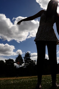
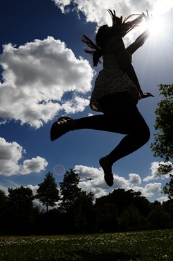
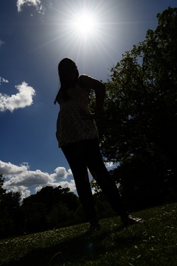
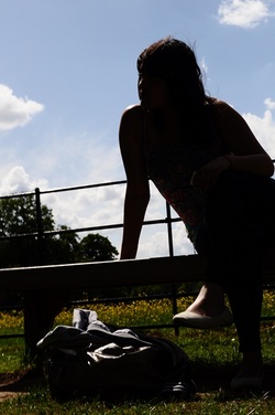
Silhouette Photography
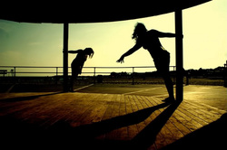
When Looking at the images of Lady Gaga I wanted to take photographs where the images had meaning. While thinking about this I really wanted to do something different to taking fashion photographs like the ones of Lady Gaga. I wanted to capture 'in the moment' images which means that they weren't posed or staged. Thinking about this even more so I wanted to take images where the natural light source was the main source of light. Silhouette photography is how I will make these images dramatic and powerful. What I like about this style of photography is how the natural sunlight has been used to create such strong photographs. I have selected photographs which have really inspired me and helped me with this project and have analysed some of the images.


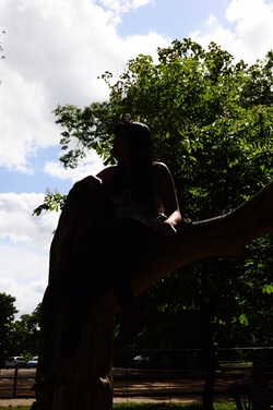
Mini Project Experimentation Final Piece
I have selected some images from hundreds of pictures I took as I was trying to take silhouette photographs. The photographs below were images that did not turn out as silhouettes so I used Photoshop and GIMP to select my models using the lasso tool and turn down the brightness and increase the contrast. This turned the subjects of the images into dark figures making them appear to be silhouette. I also took some images that hadn't been edited at all which were already silhouette photographs. In order to create these images I had to place my models in front of the sun so they would create dark figures. I also used the scene setting on my camera and then selected the silhouette setting, this helped me achieve the silhouette style of photography.
Before

After


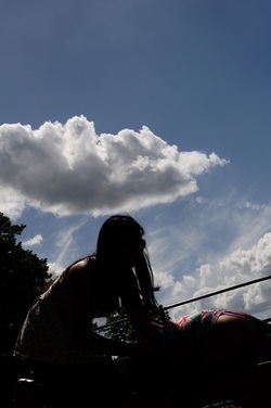
Natural Silhouette Photographs
The images below have been taken as natural silhouettes. The reason these images have come out as silhouettes because the model/s are positioned directly in front of the lens with the sun directly behind them making them appear dark figures. I have captured in the moment photos of 2 freinds having a good time and as they are silhouettes the images look more dramatic. I think the photographs are about 80% successful I think I captured the essence of 'capturing the moment' but the silhouette photography could have been better because they weren't complete silhouettes as parts of the model/s are visible.